Pages

Tuesday, March 15, 2011

HAI- mindmap/scribbles/font options

Materials/textures: Stained rice paper? Wood-Bamboo-tree bark.
Colours- subtle, light, pastel-ish. Watercolour. 
 Continuous theme: Contrast of the elements.
I think I will use the circled symbols as a watermark on the middle of each page, or in some form. Also these are the different fonts I've found may work.

Totally time spent for mind map ideas and fonts: 35 mins

Saturday, March 12, 2011

HAI! Research

For DMA234 we have a creative project to design a asian menu.
So far I have been doing research and looking for inspiration. Here is a link to my image spark account. It has some photos that I am looking to for inspiration.

http://www.imgspark.com/image/listing/naomileblanc/

For some reason my account is being temper mental. So I will post some of the other photos here until image spark wants to behave itself.

Here is my original soy sauce painting from last semester.


After researching a bit. I was most inspired by the architecture and plants. So far my idea is to combine the straight edges and stability of man made  structures and the natural elements of plants. Straight lines and boxes. Cherry blossoms, orchids,trees maybe water. 

I really like the screen dividers. I think I will want my menu to imitate one of those. and combine the structure of the buildings. With the flower images for contrast.

I will post a mind map soon to show more of my thinking process.

Total time doing research,brainstorming and uploading pics: 45 mins

Are You Strange?

Some Mock up ideas of for DMA 500 of project 2. 


Thursday, March 10, 2011

Thursday, March 3, 2011

Minskoa- Final Poster Option

Final:
I did not go with the building pictures. They just weren't working. So instead I took the colour scheme ideas and adventure aspects of my initial ideas. 


 This is the original photo I used. It's picture I took of a path at High Park. For the poster I used three layers of the photo using the difference blending mode. which muted the colours except for the different pink shades.


Another idea I was playing around with. Not completely finished. I felt like it was missing something. 


*All information and creative in this design project is provided for educational, informational and referential purposes only. The The MinSkoa71© brand concept is meant to serve as a guide for students and is not associated with the college or its programs. AndrewTedford©2011.*


Sunday, February 27, 2011

Minskoa71- QRcode, Splashes, Boots

The shoe ad assignment requires us to incorporate a QR code into the design.


Splashes...


Boots


DMA 233- Lyrics- I Need A Doctor

For this assignment we had to choose a lyrics or a song and use type/images to illustrate the meaning of the words. I generally do not like using too many fonts in one composition. However, it was helpful in figuring out appropriate fonts for different uses.


For this one I tried to focus on the mind being lost. In each work I emphasized the important words. But hopefully the main theme is clear.
For this one the images focuses on the time line.


My third piece focuses on being brought back to life. I will add it up soon. It is taking an too long to load at the moment.

Saturday, February 26, 2011

DMA 233- Working with words

For this assignment we had to use text to express words.
 For the first explosion word I wanted to make it look as if the letters are actually exploding out of the center of the page. In the second one I went for the same kind of set up but in this one the explosion already happened and the letters are all everywhere. I think I may change the font of the second one. The more and more I look at it the more I hate it.
For my second word I chose repetition. The first one reminds me of a newspaper for some reason. Like columns and headlines. Not sure if I am happy with it. But I think it gets the point across.


For this one I just repeated a few of the letters behind the word. But I am thinking of using this font for my second explosion piece. Reminds me of the TNT symbol.


My third word is most likely gonna be hiccups. I'll post more soon.

DMA 233- Exercise 1

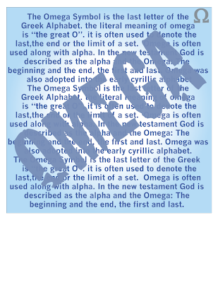
For this assignment we had to focus on one element at a time. One being the most prominent to the least prominent.
In this one I think the text is most important because the symbol is acting as a border almost.


In this one the symbol is the most important element. Out of the three designs I like this one the best.

 The title name is the most important.


Minskoa 71- Some photos

So I went through some of my older photography to find pictures that I though could work for my shoe ad. Sort of a city scene. The buildings also represent the strength and stability and grande scale of thet shoe brand. I also think it could work with the heroine theme I have been working with. 

Maybe some light splashes could work. Have some sketches and thoughts I will upload when I get them on my computer.